How to Calculate the Mortality of Joe Biden

Written by Benjamin Turner

This article was published on 10/9/202 on 7:15 am on LinkedIn. It was removed on 9:15 am of the same day by LinkedIn.

Fraudspotters, LLC, nor its employees express any opinion about this article. We are publishing it out of solidarity with an employee.

As an actuary, I’m asked how long to expect Joe Biden to live.

This is a morbid question but relevant. We just experienced a VP debate which may have actually been our presidential debate, and this is a good opportunity to teach people about actuarial mathematics. And, as an actuary, this type of stuff is literally what I do, so it is not morbid to me; it is common place.

So, without further ado…

To calculate the mortality rate go to a published actuary table. An obvious one is found here, and I will reference this table. You should see a webpage that looks like the image below. This is a table produced by the Social Security Administration to project how long people will live for purposes of understanding how much will be paid from Social Security (at a younger age, I worked as a pension actuarial analyst for Mercer Consulting).

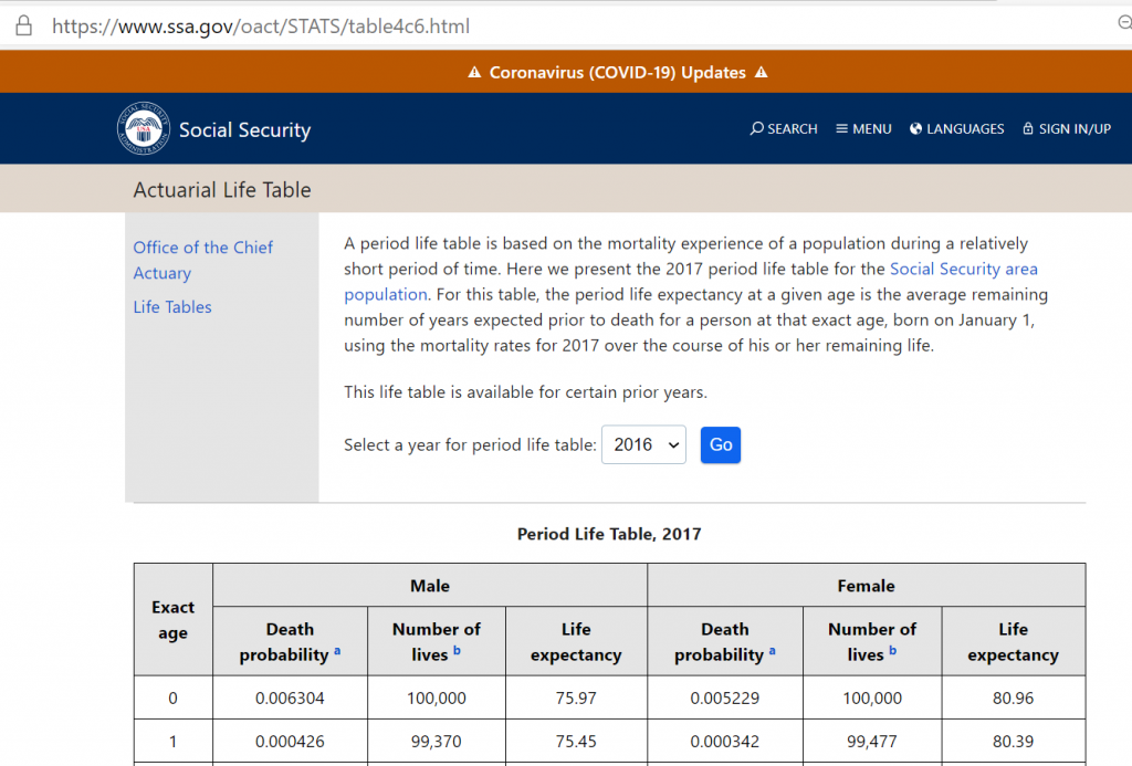
The place that says “select a year for period life table: 2016” is referencing the data / time period used for estimation. We are going to use 2016 as this is the latest year offered at this website; however, if you select slightly different years you won’t see much of a change as the mortality rate is not changing much for Americans.

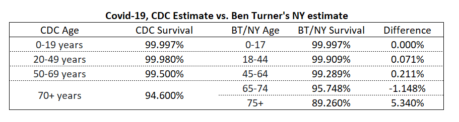
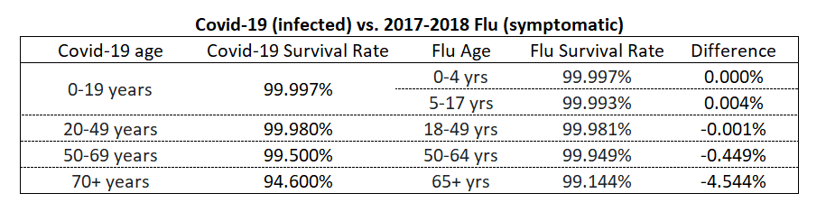
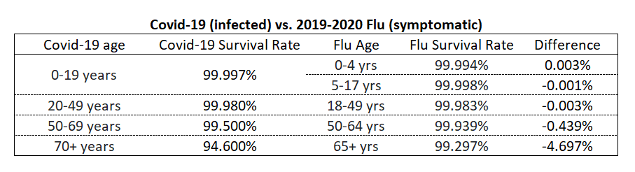
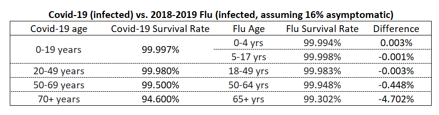
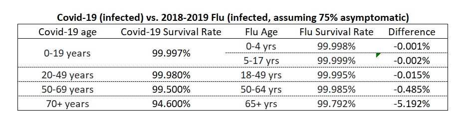
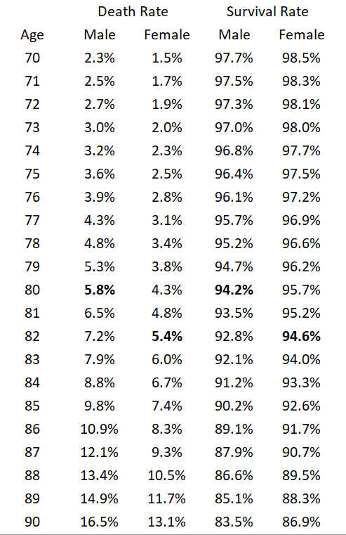
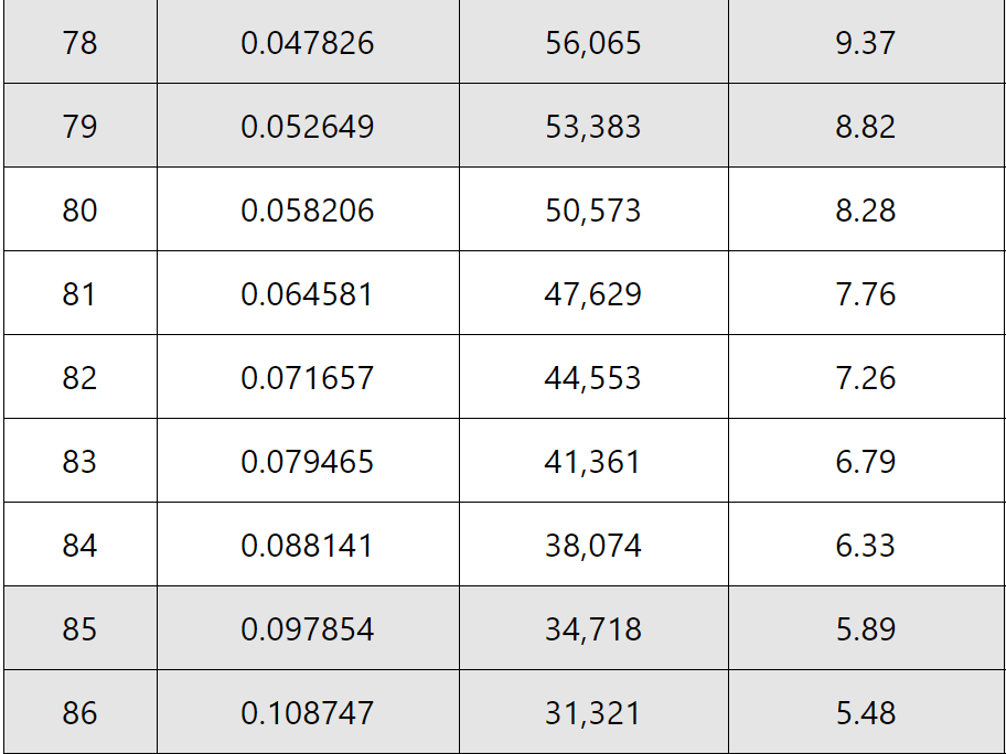
Since Joe Biden is male and will be 78 in November, we are going to obtain data relevant to that age and gender. Below is the data I will be using. In the first column, the first value, which is .047826, is the chance of dying in that age. I will be focused on this column because if we do 1-X on this column we get the survival rate. So, for example, the chance of surviving from age 78 to age 79 is 1-.047826 = 0.952174 = 95.2174% This is similar to the chance of surviving Covid-19 if you are over 70, which is 94.6%.

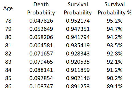
If we perform the 1-X calculation on all of the relevant ages we obtain the following table shown below. The survival probability is the chance of living to the next age, given that you survived to the given age. So, for example, if Joe Biden lives to age 86 he has an 89.1% chance of making it to age 87.

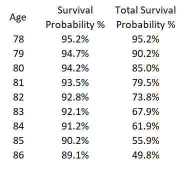
If we want to calculate the chance of making it several years than we combine the survival rates by multiplying them together. For example, the chance of making it from age 78 through age 79 to age 80 is 95.2% X 94.7% = 90.2%

If we perform this type of mathematics from age to age, we obtain Joe Biden’s chances of making it to a given age. As the table below shows, if Joe Biden serves two terms, his expected chance of surviving to the end is 49.8%. In other words, over a two-term time period, there is a 50.2% chance that Joe Biden’s VP has to be sworn-in. In addition to mortality, there is the chance of becoming disabled, but that is not the purpose of this post.

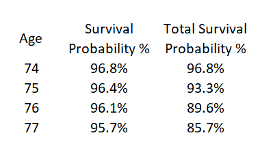
If you have read this far, you probably are wondering Donald Trump’s chances of making it to the end of four years. Donald Trump is male and turned 74 back in June, so we’ll use male and age 74. As the table below shows, there is a 85.7% chance of survival. In other words, there is 14.3% chance that over the next term, Donald Trump’s VP would need to be sworn- in. (Please note, the purpose of this article is not to compare/contrast Donald Trump’s chance of survival to that of Joe Biden. There are other factors besides their ages that affect their probability of survival. I am not a privy to those factors. This article is to teach the reader the basic concepts of how to calculate the chances of survival.)

Final thoughts/changing topics.

LinkedIn censored my last article about the mortality rate of infectious diseases on the grounds of “misinformation”. They removed it. When I challenged their removal, they gave a “second look” and affirmed their ban of my article. All data in that article was from the reputable sources such as the CDC or the Social Security Administration; I provided no original research. My only contribution was that I simply explained to the reader how to do the math, like I am doing in this article. That article can be seen here.

To LinkedIn, I’d like to coin a phrase by saying the following, “True science never censors, it only counters with the truth.” If you believe something I say is untrue, please counter with something you believe is true.

You Can Compare and Contrast Covid-19 to the Flu

By Benjamin Turner

Published on 2020-10-05 16:53 on LinkedIn

———————————————————————–

BANNED BY LINKEDIN ON 10-6-2020

Fraudspotters, LLC, takes no position with regards to this article. Furthermore, this article does not reflect the opinion of all employees.

However, in solidarity with our lead analyst, and in the interest of freedom of information on the Internet, we are posting the article below….

———————————————————————–

There seems to be a lot of buzz on the web about Covid-19 vs. the flu, so I thought I’d provide some thoughts.

Before I do, let me take a victory lap.

On August 21, 2020, I wrote an article teaching readers how to compute survival rate of those infected with the disease by using New York data. At the time, I think my estimates seemed overly optimistic to most people.

However, on September 10, 2020, the CDC itself came out with something similar to what I had written.

In fact, their numbers are a little more optimistic than mine, reflecting a nationwide estimate and not just New York. Here is a comparison; you can see we are very close for ages 49 and under:

No alt text provided for this image

So, how does this compare to the flu?

Well, the main difficulty is that people typically aren’t tested for flu antibodies to see if they had it, while there is a massive effort underway to understand who has had Covid-19.

For example, you, the reader have probably already had the flu in your life. Are you going to get tested to see if you had it in the last 12 months but were not symptomatic? And, if so, how reliable would such a test be?

But, you the reader, probably will know if you have covid-19, because you will likely have a blood test sometime in the future (if you haven’t already) to assess if you should get vaccinated.

So, given that you will find out if you had Covid-19, and you probably will find out if you have symptomatic flu, but probably not asymptomatic flu, how do your chances of survival compare: a) COVID-19 if you are infected vs b) the flu if you have symptoms?

I have already shown you the survival rate for COVID-19, so all we need is the survival rate for symptomatic flu. To calculate this, look up the chance of death for flu if you have symptoms.

No alt text provided for this image

Calculate survival rate by comparing the deaths to those with symptoms and the changing it from a death rate to survivor rate by performing 1-X.

No alt text provided for this image

Next, simply compare this survival rate to the Covid-19 infected survival rate.


You can do the same thing for the 2017-2018 flu year.

No alt text provided for this image

You can also do it for the 2019-2020 estimate of flu.

No alt text provided for this image

As you can see, if you are 49 years old, or younger, and you have Covid-19 (symptomatic or asymptomatic), your chances of death are not materially different than if you have symptoms of the flu.

For those aged 50-69, the difference is noteworthy, but also note that the flu age group is 50-64, whereas the Covid-19 age group is 50-69. There may be a big difference for those age 65-69 with less of a difference for ages 50-64.

And, there is a larger difference for those aged 70 and older.

94.6% survival rate vs 99.2% survival rate is noteworthy. Perhaps the improving treatment protocols will narrow this gap in the future.

Asymptomatic Flu

Everyone who reads this article asks about asymptomatic flu. Since we don’t really know how much asymptomatic flu actually occurs, the only thing I can do is provide estimates.

If we assume 16% of flu cases are asymptomatic, the numbers become (which probably doesn’t change any conclusions you have made in reading this article):

No alt text provided for this image

If we assume 75% of flu cases are asymptomatic (meaning there are 4X more cases–note this is an update to my article), then the numbers become.

No alt text provided for this image

I provide more details in the appendix.

I also think it is worth reiterating that a survival rate of 94.6% vs. a survival rate of somewhere in 99% range (the survival rates shown for 70+ years) is a pretty big difference. If you switch it back to death rates, we are saying about 5% of people who are over 70 who get covid-19 will die but only about 0.2% to 0.9% of people over 70 who get the flu will die.

On the other hand, people often believe it is a “death sentence” for older people who get Covid-19. That is not a valid belief and will become less and less so as treatments improve.

With regards to the comparative risk among individuals in the other age brackets, I will let you draw your own conclusions.

End of article.

————————————————————————————————————–

Appendix / Additional Thoughts

1) Asymptomatic flu.

You may be wondering how many people are asymptomatic with regards to the flu. I’m not sure if it is relevant. You have likely already had the flu in your life. Having asymptomatic flu simply means you got it again but didn’t notice. (This is different than the Covid-19 scenario–you have not had it in the past, and if you have it asymptomatically, you likely WILL know you had it when taking a blood test prior to being vaccinated.)

I found this to be the best summary of available data, and as you can see the results are so wide I did not know how to apply them to analysis. The paper appears to be saying that estimates range from 4% to 28%, 0% to 100%, and 65% to 85%. Seeing the wide array of estimates and knowing that all that it means is that you got it again but didn’t notice, I abandoned trying to incorporate asymptomatic flu data into my main article but provide some what-if analysis at the end.

Methods

We conducted a systematic review and meta-analysis of published estimates of the asymptomatic fraction of influenza virus infections. We found that estimates of the asymptomatic fraction were reported from two different types of studies: first, outbreak investigations with short-term follow-up of potentially exposed persons and virologic confirmation of infections; second, studies conducted across epidemics typically evaluating rates of acute respiratory illness among persons with serologic evidence of infection, in some cases adjusting for background rates of illness from other causes.

Results

Most point estimates from studies of outbreak investigations fell in the range 4%–28% with low heterogeneity (I2=0%) with a pooled mean of 16% (95% CI: 13%, 19%). Estimates from the studies conducted across epidemics without adjustment were very heterogeneous (point estimates 0%–100%; I2=97%), while estimates from studies that adjusted for background illnesses were more consistent with point estimates in the range 65%–85% and moderate heterogeneity (I2=58%).

2) How many people get the flu in a given year?

I found this to be a good source of info. It is saying that about 9% of people get it each year, except people over age 65 have a lower rate of infection at about 4%. The overall average is about 8%, which means the average person will experience symptoms every 11 to 12 years (even though we have a widely distributed vaccine program).

No alt text provided for this image

3) What was the survival rate in a given age for older people prior to Covid-19?

In the article above, I demonstrated that the CDC says the survival rate for someone age 70 or higher is 94.6%, meaning 5.4% die.

You may be wondering, what percentage of people age 70 or higher die in a given year due to age or other causes not related to Covid-19. I present the table below which shows the death percentage and the survival percentage by age for the USA in a given year computied using 2017 data. For males, living a year at age 80 is more dangerous than getting COVID-19 for the age group of 70+. The equivalent benchmark for females is age 82.

No alt text provided for this image

Finally, the end. BTW, if you read this far and enjoyed this information, please consider reposting it while you still can!

Other Articles by Benjamin Turner

Record Shattering Fire Season Am I Misunderstanding Something

“Record shattering fire season”​? Am I misunderstanding something?

As I read the news, I keep coming across headlines that say “record shattering fire season”.

Many of you who are connected to me on Linkedin are in the insurance industry and have access to data that I may not have. If you could point me in the right direction, I’d appreciate it.

————————————————

Please note, I received some excellent feedback from Randal O’Toole. Rather than go through the article and make any needed changes, I am going to provide some updated perspective at the bottom.

————————————————

For me, this is what I can find:

NIFC puts acres burned at 7.1m as of 9/24/2020.

That is a lot of acres, but is it out of the ordinary?

When I search the web, I come across things like this:

“In 1930 and 1931, over 50 million acres burned each year and during the 10 year (hot and dry) period from the late 1920’s to the late 1930’s an AVERAGE of 30 million acres burned every year in the United States. Additionally, the 2001 National Fire Plan update indicates that an average of 145 million acres burned annually in the pre-industrial, conterminous United States.”

Here is more data. David South testified to congress, with charts showing 30m+ acres burning prior the 1950s, and credits Stephen Pyne for the older data.

Here is a table of data from NIFC. Although the website cautions about using information prior to 1983, it seems like the main change that happens at 1983 is the method for counting the number of fires, not acres. This data also supports the idea of 30m acres burning prior to 1950, although again, there is a caveat about the older data from this source. (Note that this probably is the same data source as the preceding article, but I include it here so that you can see more than one source on the web. I have been able to find no other estimates of acres burned and have encountered nobody on the web arguing against these values.)

No alt text provided for this image

And from a pure history/story telling perspective, the Chinchaga fire (just one fire) in 1950, by itself, caused 4.2m acres to burn in Canada.

And the “Big Blowup” (one fire) burned 3m acres in TWO DAYS.

So, from a historical point of view, the year 2020, and its 7 million acres does not seem like it will end being something considered “record shattering”.

Also, please note, our level of forests has not changed much over the last 100 years. Seven million burned this year is 1% of our forest. Based on the data, we appear likely to burn some percentage a year, say 0.5% to 3%. If we burn 1% of our forest, than it will average 50 years before it is burned again. Note that not all trees burn in a fire as some of the trees make it through the fire while the dead stuff is cleared out.

No alt text provided for this image

I would say that all data seems to point to the fact that we had much bigger fires in the past. Can any of my Linkedin connections point me to a better/contrary data set?

Having said that about the past, let’s pivot to the more recent data.

From a recent point of view, is the year 2020 out of the ordinary?

If we look at the chart I referenced above and restrict it to data from just 1990 to the present, we can obtain the following statistics. Mean = 5.6m acres. Standard Deviation = 2.7m acres.

If we finish 2020 at, say 8m acres, we will be at one standard deviation above the mean. Furthermore, 8m acres would mean the year 2020 has less acres burned than nine of the other years from 1990 to the present.

Why all this press about this “record breaking” year? Yes it is higher than the 30-year average, but “record breaking”? Am I missing something? Perhaps we are just getting started and many more acres are still to be burned in 2020?

Isn’t the real anomaly 1950 to 1990? It appears we successfully suppressed fires during this time period and now we are seeing that we can really only hold it to about 5m to 10m acres a year because the forest is not sufficiently thin and eventually big fires breaks out. Shouldn’t insurance companies and the general population expect this?

And, isn’t the real public policy issue that there are now many buildings in the forest that we have to insure and protect? And isn’t it crucial that regulatory bodies allow insurance prices to adequately reflect the risk so as to adequately incentivize the proper location of buildings?

I believe the correct course of action can only happen if people understand the true context of forest fires, which is, without massive thinning of the forests, the fires appear inevitable: either as prescribed burns or actual out of control fires. If we are not going to thin the forests, we need to carefully plan where we put buildings and/or allow insurance companies to adequately charge for a significant (say 1 every 50 to 100 years) chance of the building being burned down.

If you can provide me with more context or data, please let me know. If I am way off in my thinking, I’ll amend or delete this post. I enjoy having respectful dialogue with people on the web.

———————————————–

Update.

This is an update based on some great feedback from Randal O’Toole who has a blog on this subject.

I am going to summarize what I learned from him (hopefully I learned the right things.) According to him, those really big numbers in the past included prescription fires in the South.

If one just wants to consider the wild fires in the western states, here is a chart of estimates of what happened. Note, that although the chart says “all states” from the context it appears to be talking about just these states: Arizona, California, Colorado, Montana, New Mexico, Nevada , Oregon , Utah, Washington, and Wyoming. You can see really big years back in the 20s and 30s, and, as I pointed out above, we are no where near any records in the latest year. Please note that the actual data is the faint color “observed” data. The dark line is “reconstructed” data.