
https://www.wtvq.com/2020/10/29/mt-sterling-crop-insurance-agent-adjuster-plead-guilty-to-23-million-fraud/
COVID-19, Red vs. Blue vs. Europe
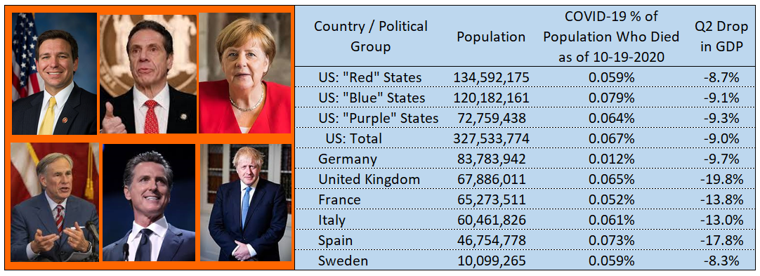
I’ve observed a lot of angry debate about which country/state/political party has handled the COVID-19 crisis the best. As I read various articles online, I struggled to find anything that presented quantifiable evidence as opposed to partisan rhetoric, let alone anything that clearly and succinctly pulled the data together, so last night I did it myself. This article is for you to see what I found.
I organized data from publicly available sources into one table which I present below. The rest of the article explains how I pulled the data together.
How I determined Red vs. Blue vs. Purple States and European Countries
I went to Wikipedia, “Table of U.S. state party statistics as of November 2019“. I pulled the data into a spreadsheet and designated a state as “blue” if the Republican Party had no control over the state house, state senate, or governorship. I designated as “red” if the Democratic Party has no control of the state house, state senate, or governorship. All others were designated as “purple”. For European countries I picked the five largest Western European countries and added Sweden because of its well known practices related to COVID-19. (I didn’t add other smaller countries such as Denmark because it takes the conversation down a rabbit hole.)
How I determined the percentage of population who died
I went to Worldometers for both country and state. I pulled the number who died and put it in my spreadsheet which already had party affiliation and population. I divided those who died by the population of the political unit to make percentages who died.
How I determined the economics
This was much more challenging than I expected.
You cannot compare unemployment data from the U.S. vs. Europe because European countries count people who are employed but with reduced or no hours as “employed”.
It is difficult to compare U.S. GDP results to those of Europe, because the U.S. displays its data on an annualized basis while other countries show quarterly results.
The OECD computes rates for both Europe and the U.S. on the same basis. (Here is a chart.) Nobody seems to be disputing the OECD’s figures. For example, here is an article by CNN using this sort of metric for comparison.
I could only find U.S. state data on an annualized basis. So, I took the U.S. state data and applied a ratio to it, to make it in the aggregate equal to the OECD total US GDP change of -9.0%. The ratio used was “9.0/31.4”. By multiplying this ratio against the annualized GDP per state, I produced a value that in the aggregate would produce the -9.0% GDP that the OECD says the USA experienced. Next, I used the proportion of GDP of each state in 2020Q1 to weight the changes that happened from Q1 to Q2 to produce a weighted average change for Red vs. Blue. vs. Purple states.
For US states, I obtained the following results:

How can you do this?
I’ve given you all the links. If you would like my spreadsheet, contact me, I’ll gladly share. Also, if you detect something wrong with my data, please let me know! I’ll fix/update this article.
Why do I do this?
When I finish doing my day job, I read the news and think about what is going on. I observe a lot of heated political discussion. I am surprised at how hard it is to answer basic questions, so I search the web. Then I think that I might as well share on social media. I’ve done this with regards to COVID-19, wildfires, Joe Biden’s longevity, and the flu.
What is my day job?
Most of my career I’ve been in management of insurance companies. Currently I am helping some insurance companies with some projects, and I am also building algorithms for FraudSpotters. These algorithms are very successful at detecting fraud rings who are trying to scam insurance companies. I believe we have invented something groundbreaking. If you think our algorithms can help you, please contact me and I’ll gladly run them for free on your data to prove the point.