I continue to be quite intrigued by the concept of an individual being able to bring a private action related to fraud.
Here is an article about it:
The Power behind California’s Insurance Fraud Prevention Act (natlawreview.com)

Leads for insurance SIU via proprietary algorithms
I continue to be quite intrigued by the concept of an individual being able to bring a private action related to fraud.
Here is an article about it:
The Power behind California’s Insurance Fraud Prevention Act (natlawreview.com)
Florida: fake treatment alleged in disability claim. “The state said she took part in an insurance billing scheme involving fraudulent medical documents tied to fake hospitalizations between 2016 to 2019.”
https://cbs12.com/news/local/woman-from-greenacres-charged-in-disability-insurance-fraud-scheme
In my actuarial career, I have been presented with many theories related to claim and premium fraud. The task is to evaluate whether the theory has any credibility and if so, how much, and what type of effort should be put into a particular process associated with the theory. Typically, a given insurance fraud theory has proponents who feel quite certain that a particular “flag” is associated with fraud. On the other hand, there are typically people who believe some other flag is associated with lack of fraud, and claims with those flags should be “fast tracked”.
Within an insurance context, actuaries are commonly called on to settle questions using statistics. For example, suppose a claims adjuster suspects that fraud rings are not creative enough to use different security questions and/or IP addresses for their claims. Statistical tests can be constructed to determine whether 1) this IP address and/or security question seems to occur randomly, and 2) whether it correlates with an outcome in a non-random way. A good example of this type of red flag analysis is seen in a recent occurrence where a defendant used his pet’s name “Benji” as his security question answer and the same IP address. The defendant used the same security answer “Benji” on 250 different unemployment applications, over a 12-month period, to collect $1.4 million dollars.
In evaluating “red flags” or “green flags” one needs a framework for assessing their merit. I have found it quite useful to evaluate both the “randomness” of the flag and its correlation with the outcome. A good example from my career relates to the flag for “police report”. Many companies use this flag to indicate that the claim should be fast tracked, but I have personally seen fraud rings routinely call the police in an effort to create just such a flag, hoping for that precise outcome. I cannot recommend this flag as a “green flag”. Is it a red flag? That can only be judged through analysis.
With the ability to create many different models to test a theory related to fraud, the question is not necessarily which model is the best fit in the traditional data mining sense. For example, we are not trying to use this model to predict the next outcome, as most datamining methods would be attempting to do. In the context of insurance, the model most useful for evaluating a theory relating to fraud doesn’t necessarily produce the highest expected claim severity or highest frequency. Statistically the model doesn’t have the highest R-square or lowest AIC. A holdout dataset is also unnecessary because our point is not whether the model predicts an outcome the best. Rather, the most useful model is designed to test whether a particular theory related to a particular flag has enough evidence to warrant deployment of resources in the manner proposed by its proponents.
The 2020 election provides some interesting, nonproprietary, data to show concepts related to the statistical evaluation of a theory of fraud. In this election, some purport that the very presence of a particular brand of machines is a red flag. As this data is public, and as most people are aware of the allegations, this dataset provides an interesting backdrop for discussion.
There are a few points I would like to make with this paper:
The United Stated had a contentious election in 2020. One theory was that somehow particular election machines affected outcomes. While we cannot test if machines directly affected an outcome, we can test whether a machine is correlated with an unexpected result. Correlation does not prove causation; it only identifies whether a particular red flag warrants further investigation. The investigation could then look at the machines or at other factors having nothing directly to do with the machines but which correlates with their use.
To construct this study, one must evaluate whether inputs or outputs are non-random. The inputs into this theory are which geographical areas used particular machines. This is not particularly useful because the process by which a county selects a machine IS non-random and will have partisan tendencies.
The output is the election outcomes. In theory, the change in party vote share from one election to another could change uniformly across all counties. However, a more plausible scenario is that voter preferences by demographic change over time and this results in nonuniform changes in election results. For example, a county that is populated predominately by retirees may trend in ways similar to other counties of the same age, whereas counties comprised predominantly of young people may trend in a different direction.
However, the chosen election machine should not correlate with a change in election results if the proper adjustments are made to the analysis, meaning, an election machine should look like a random variable after adjusting for other demographic variables. However, what constituted a proper adjustments is subjective. Someone can select different adjustments to emphasize their point. This author attempts to show a wide variety of adjustments by demonstrating various regressions that can be performed.
It is important to state that correlation does not prove causation, and even the reverse is true; someone can commit fraud so poorly that the intended outcome is not affected. Consequently, this type of analysis rarely can prove or disprove whether fraud is committed or not committed. However, it provides a reasonable basis for assessing whether more investigatory resources should be deployed.
The data was obtained from four sources: 1) Prior election data from: MIT Election Data Science Lab, 2) Current election data from: Politico , 3) election machine flags from: VerifiedVoting.Org, and 4) demographic data on a county level from the U.S. Department of Agriculture.
The comparison period was 2008 vs 2020. So chosen because in the year 2008, the particular machine most questioned was not dominant in the U.S., and the fraud allegations are specific to the 2020 election. This avoids the author having to guess what theoretically did or did not happened in 2012 or 2016.
Two states, New York and Alaska, were excluded because of data and study design issues. The following locations were also dropped from the study because of lack of ability to match all data sources: District of Columbia – DC, LaSalle – IL, Baltimore city – MD, St. Louis – MO, St. Louis city – MO, McCormick – SC, DeWitt – TX
While the author attempted to use all demographic data from the Department of Agriculture, some variables, when both are included in a regression, no longer allow that regression to have a solution. For example, the field called “metro2013” indicates with a 1 or 0 if the county was part of a metro area. Another field called “nonmetro2013” displays a 1 or a 0 if it is not part of a metro area. While both flags are valid, if both are put into the same regression, because they are exactly opposite of each other, the regression no longer has a solution and therefore fails. To deal with this issue, the author pre-emptively removed one of the two fields. The fields that were dropped are: Metro2013, Oil_Gas_Change, NonmetroNotAdj2003, NonmetroAdj2003, Noncore2003, and TotalHH. There will be more explanation related to these types of issues in a later section on heteroskedasticity.
In addition to the demographic data from the Department of Agriculture, the analysis includes fields which were derived from the Department of Agriculture’s data and were used in a prior web post by the author. For example, “LargePopCountiesTop657” is a field the author derived which indicates that a county is among the top 657 most populated counties from the Department of Agriculture’s field “TotalPopEst2019”. This field, for example, was intended to be a proxy for an election machine that specialized in large population counties.
Additionally, the author added random variables to allow the reader to see how random variables perform in this type of analysis. The following fields were added:
Note that these random variables naturally had correlations with the demographic variables that were similar to the correlation of election machine flags to the demographic variables, so that additional random correlation was not needed for this exercise. (See here.)
Election machine variables (Dominion Alternate, Election Systems Software, Unisyn Voting Solutions and VotingWorks flags) were based on an algorithm which categorized the county as having the presence of a particular voting machine. Click here for the R code used to categorize the machines. Note that these machine flags are not mutually exclusive, and a particular county may be flagged with more than one machine or not have any flagged machine at all. Also note that the flag for the brand Dominion is marked as “Dominion Alternate” because this method is slightly different than what was used in prior articles and the author believes it is more accurate. The author believes that all potentially relevant machines are included. Here is a summary of the election machine flags:
| Machine Flag | Counties Flagged | % of Total 2008 + 2020 Vote |
| Election Systems Software Flag | 1456 | 44.5% |
| Dominion Alternate Flag | 629 | 28.5% |
| Democracy Live Flag | 436 | 24.8% |
| VotingWorks Flag | 273 | 11.9% |
| Unisyn Voting Solutions Flag | 248 | 4.0% |
The data included the Y variable (the change in Democratic voter share calculated only using Republican and Democratic votes, not third-party votes), a weight which was the total Democratic and Republican votes in both elections combined, and 185 predictor variables, including demographic variables, election machines, and random variables. The number of rows of information, which primarily represent counties, was 3043. To obtain a copy of this dataset, click here.
To be clear, the formula being tested is as follows:

By altering the X1, X2, and X3 fields, we tested every combination of demographic variables, random variables, and machine variables.
Our objective is NOT to find the “best fit” using someone’s preferred definition of best fit. Rather, we are attempting to see if any of the election machines show unexpected/unexplained correlation as compared to random variables.
The author constructed R code to iterate through all permutations of predictors three at a time, along with an intercept. For example, one permutation could be:
Change in Vote Share = a*intercept + b1*Age65AndOlderPct2010 + b2*PopDensity2010 + b3*WhiteNonHispanicPct2010 + error term.
Then the next permutation could be the same as the prior with one change:
Change in Vote Share = a*intercept + b1*Age65AndOlderPct2010 + b2*PopDensity2010 + b3*BlackNonHispanicPct2010 + error term.
This process was executed approximately 185*184*179 = 6,093,160 times for the purpose of seeing how consistent the results are for estimators for the effect on the election of different election machines. We also see how random variables perform in this type of analysis and are able to use this as a control.
When running this analysis, it is obvious that the following two regressions are the same with merely the values for b2 and b3 being swapped:
a) Change in Vote Share = a*intercept + b1*Age65AndOlderPct2010 + b2*PopDensity2010 + b3*BlackNonHispanicPct2010 + error term
b) Change in Vote Share = a*intercept + b1*Age65AndOlderPct2010 + b2*BlackNonHispanicPct2010 + b3*PopDensity2010 + error term
This type of order swapping happens 3*2*1=6 times and can be eliminated by controlling the looping algorithm.
The author ran both a full loop and a controlled loop. Running both methods produced output that was identical to the 10th decimal, which is close enough for this analysis.
Here is the R code: FullLoop and ShorterLoop.
Below is the full loop:
#clear objects
rm(list = ls())
#clear memory
gc()

#Load libraries
library("sandwich") # for use with Sandwich estimator
library("lmtest")  # for use with linear models
library("magrittr") # so we can use commands like %>% which pipes the result into the next command
library("dplyr") # so we can use commands like mutate and summarize
library("data.table") # so we can use data tables

#Set working directory. Remember to put the slashes as forward slashes:
setwd('C:/Users/Benja/Downloads')

#Read Data
loadedData <- read.csv("DataSetWithManyColumns.csv" , header=TRUE, sep=",")

#Get Variables
namelist<-names(loadedData)

#Create a table to accept the results
df2 = data.table(coefName=rep(c("x"),each=1)
                 , coefValue = rnorm(1)
                 , coefPValue = rnorm(1)
                 , coefSPValue = rnorm(1)
                 , iterationCounter = rnorm(1))

# delete the first row which was just a placeholder
df2 <- df2[-c(1),]

########################################
#Begin Loop
########################################

#Set time
ptm <- proc.time()
iteratorCount = 1
#Create loop that loops through various regressions
for (i in 191:7){
  #print where we are so one can monitor the progress
  print(i)
  #show memory so that one can monitor if it is about to run out.
  print(memory.size())
  #gc stands for garbage collection and it means we are freeing memory
  gc()
  #print a status of how long the iteration took
  print ( proc.time() - ptm )
  #reset the timer
  ptm <- proc.time()
  #perform 2nd, inner, loop
  for (j in 7:191){
    # create a table that is temporarily used within the 2nd inner loop; this was necessary to manage performance of the machine.
    df1 = data.table(coefName=rep(c("x"),each=1)
                     , coefValue = rnorm(1)
                     , coefPValue  = rnorm(1)
                     , coefSPValue = rnorm(1)
                     , iterationCounter = rnorm(1))
    # delete the first row which was just a placeholder
    df1 <- df1[-c(1),]

    #Create 3rd, inner, loop
    for (k in 7:191){
      if(i==j | i==k | j==k | j==i) {
        #do nothing because there are duplicate fields in the regression
      }
      else {
        # Run regression
        lmOutput <- lm(reformulate(namelist[c(i,j, k)],"Difference"), weight = TotalVotes, data = loadedData)
        tester <- summary(lmOutput, complete=TRUE)
        tester2 <- coeftest(lmOutput, vcov = sandwich)

        # Obtain values from regression
        df1 <- df1 %>% add_row( coefName = namelist[i],coefValue=tester$coefficients[2,1], coefPValue=tester$coefficients[2,4], coefSPValue=tester2[2,4], iterationCounter = iteratorCount)
        df1 <- df1 %>% add_row( coefName = namelist[j],coefValue=tester$coefficients[3,1], coefPValue=tester$coefficients[3,4], coefSPValue=tester2[3,4], iterationCounter = iteratorCount)
        df1 <- df1 %>% add_row( coefName = namelist[k],coefValue=tester$coefficients[4,1], coefPValue=tester$coefficients[4,4], coefSPValue=tester2[4,4], iterationCounter = iteratorCount)
        iteratorCount = iteratorCount + 1
      } #end else
    } # end loop 3
    # bind the results of loop 2 to the big table with all of the results
    # I found this to be the best way to manage the memory/throughput of the machine
    df2 <-rbind(df2, df1)
  } # end loop 2
} # end loop 3

########################################
#end loop
########################################

#Let user know the loop has completed; it took my computer 24 hours
print("Loop of regressions completed.")

#next save giant dataset as an RDA file.
save(df2,file="df2.Rda")

#Then if you wish to load it at a later time, execute the following:
#load("df2.Rda")

# Create a table indicating whether the coefficient is positive or negative. Note this is all one statement because the %>% pipes one result to the next. See library magrittr for more info.
df3 <- df2 %>%
  mutate(coefPositive = ifelse(coefValue >=  0, 1, 0)
         , coefNegative = ifelse(coefValue <  0, 1, 0)) %>%
  group_by(coefName) %>%
  summarise( coefPositive = sum(coefPositive)
             , coefNegative = sum(coefNegative) ) %>%
  mutate(coefSign  = ifelse(coefPositive>coefNegative,1, -1 ))

#create right function
right = function(text, num_char) {
  substr(text, nchar(text) - (num_char-1), nchar(text))
}

#Create broad category field for display
df3$broadCategory = ifelse(nchar(df3$coefName) ==2 , "Random Variable",
                           ifelse(right(df3$coefName,4)=="Flag","Election Machine","Demographic Field"))

#Create specific category field for display
df3$specificCategory = ifelse(nchar(df3$coefName) ==2 , substr(df3$coefName, 1, 2),
                           ifelse(right(df3$coefName,4)=="Flag", df3$coefName ,"Demographic Field"))

#left join coefficient signs and categories to the dataset
df2 <- merge(x=df2,y=df3,by="coefName",all.x=TRUE)

# provide a summary of results.
output <- df2 %>%
  mutate(coefExists = ifelse(coefValue != 0, 1, 0)
         , coefPositive2 = ifelse(coefValue >  0, 1, 0)
         , inconsistentSign = ifelse(coefValue*coefSign < 0 , 1, 0)
         , confidentAndConsistentSign = ifelse(coefValue*coefSign > 0 & coefPValue<.05 , 1, 0)
         , confidentAndConsistentSSign = ifelse(coefValue*coefSign > 0 & coefSPValue<.05 , 1, 0)
         , pValueSignificantAt5 = ifelse(coefPValue<.05,1,0)
         , sPValueSignificantAt5 = ifelse(coefSPValue<.05,1,0)
         , pValueExists = ifelse(is.numeric(coefPValue), 1, 0 ))  %>%
  group_by(broadCategory, coefName) %>%
  summarise(
            signOfCoefficient = median(coefSign)
            , numberTimesInARegression = sum(coefExists)
            , percentInconsistentSign = sum(inconsistentSign) / sum(coefExists)
            , percentPValueSignificantAt5 = sum(pValueSignificantAt5)/sum(pValueExists)
            , percentSPValueSignificantAt5 = sum(sPValueSignificantAt5)/sum(pValueExists)
            , percentSignificantAt5AndConsistentSign = sum(confidentAndConsistentSign) / sum(coefExists)
            , percentSSignificantAt5AndConsistentSign = sum(confidentAndConsistentSSign) / sum(coefExists)
            , maxPValue = max(coefPValue)
            , maxSPValue = max(coefSPValue)
            , minPValue = min(coefPValue)
            , minSPValue = min(coefSPValue)
            , meanPValue = mean(coefPValue)
            , meanPSValue = mean(coefSPValue)
            , medianPValue = median(coefPValue)
            , medianSPValue = median(coefSPValue)
            )

#View results
View(output)

#write this output to CSV (it is too big for a clipboard)
#execute code to output the "output" to csv.
write.csv(output,"outputSummary.csv", row.names = FALSE)The full output of the iterations can be accessed here: df2.RDA. The summary output can be accessed here: outputsummary.csv. The shorter loop output is here: df2Short.RDA and its summary is here: outputsummaryShort.csv.
Either method is fine for the purposes of this paper, as 10 decimal places is sufficient for the discussion. I use this data to make the following points.
With enough permutations, it is often possible to produce formulations showing a particular variable in question to be significant, insignificant, or even a different sign than what it normally shows.
Here is an example I find enlightening. Consider the field “OwnHomePct” which is “percent of occupied housing units in the county that are owner occupied” from the USDA. In this paper’s 2008 vs 2020 analysis, this field was involved in 101,016 regressions, which could also be thought of as 101,016/(3*2*1) = 16,836 since each possible combination is repeated 6 times in different order. Of these regressions, 99.94% of the time it showed a significant negative correlation (at p-value of 5%) using the traditional methodology and 99.64% using Sandwich. With these results, most people would consider it settled science that homeownership was associated with a decrease in Democratic voter share from 2008 to 2020. However, homeownership shows a positive, not negative, association when combined with any of these pairs: BlackNonHispanicPct2010 & Ed2HSDiplomaOnlyPct, Ed2HSDiplomaOnlyPct & FemaleHHPct, Ed2HSDiplomaOnlyPct & WhiteNonHispanicPct2010, Ed5CollegePlusPct & WhiteNonHispanicPct2010, NaturalChangeRate1019 & PctEmpServices, PctEmpServices & WhiteNonHispanicPct2010. In some of these cases the positive association is “statistically significant”.
“OwnHomePct” can switch signs. What to make of this? Well, it is important to keep in mind that in the social sciences, NO variables are causative. Homeownership is not causing someone to switch from voting for a Democrat in 2008 to voting for a Republican in 2020. We are only using these variables to explain trends. Although there are 6 pairs where the regression implies that homeownership is positively associated with Democratic shift in voting pattern, there are 16,830 where it is positively associated with a Republican shift. Is the theory that homeownership tended to shift voters toward the Republican column a good theory? I’ll let you decide, but I want to add that many fields that we in the actuarial profession talk of as “causative” are really only associated in a logical way. For example, we tend to think of territory rating as causative because we can imagine some locations having more accidents, but in the strictest sense, the area does not cause these random events to occur. (True story: as a teenager I once tried to convince a judge that the curve in the road caused my accident. It didn’t work out for me.)
In a similar vein, this author cannot correctly “adjust for” human behavior with these demographic variables when evaluating proposed red flags associated with election outcomes. In a very strict sense, there is no such thing as a “correct adjustment”. This is true also when dealing with red flag analysis in insurance claims, as human behavior is not deterministic.
Suppose we are trying to evaluate the effect of WhiteNonHispanic2010 on the shift in vote from 2008 to 2020.
We can run this regression:
summary(lm(Difference~WhiteNonHispanicPct2010 , weight = TotalVotes, data = loadedData))We’ll get a negative and significant sign, meaning it is associated with a shift toward Republican.
What if we add BlackNonHispanic, like this?
summary(lm(Difference~WhiteNonHispanicPct2010 + BlackNonHispanicPct2010, weight = TotalVotes, data = loadedData))Again, for WhiteNonHispanicPct2010 we get a negative, significant sign.
Now, what if we add a Hispanic flag, like this?
summary(lm(Difference~WhiteNonHispanicPct2010 + BlackNonHispanicPct2010 + HispanicPct2010 , weight = TotalVotes, data = loadedData))Again, for WhiteNonHispanicPct2010 we get a negative, significant sign.
Now, if we add Asian:
summary(lm(Difference~WhiteNonHispanicPct2010 + BlackNonHispanicPct2010 + HispanicPct2010 + AsianNonHispanicPct2010 , weight = TotalVotes, data = loadedData))The WhiteNonHispanicPct2010 changes signs, becoming positive. It is NOT significant.
And finally, if we add Native American:
summary(lm(Difference~WhiteNonHispanicPct2010 + BlackNonHispanicPct2010 + HispanicPct2010 + AsianNonHispanicPct2010 + NativeAmericanNonHispanicPct2010, weight = TotalVotes, data = loadedData))
The WhiteNonHispanicPct2010 sign is positive and IS significant.
What just happened? We saw the coefficient for WhiteNonHispanicPct2010 change signs and become significantly positive as we added other racial indicators. Are more flags helping us ascertain truth or obscuring it?
I believe what we are seeing is multicollinearity. As all race categories used by the government become involved, the linear combination of these fields approaches 1.
This sort of thing can happen in non-obvious ways when using large numbers of predictor variables (some call this type of model “over-determined”), and is something to keep in mind when attempting to make demographic adjustments. It would be very easy to run a regression using large number of variables and believe truth is being established when the opposite is occurring.
By limited our inquire to only 3 variables at a time in a regression, we reduce the possibility of a series of demographic variables inadvertently combining in a multicollinear way.
One method to understand how randomness performs in a given analysis is to add actual random variables. As noted above, 24 random variables were added to this analysis. Using these we can attempt to understand how true randomness appears.
In this analysis, every random variable has a permutation where the minimum p-value is significant. Meaning, in a regression with an intercept, two other variables and a random variable, the random variable shows up as significant. So, it is very possible for any field added to this type of analysis to show up as “significant”. The following table highlights this result.
Table 1
| Coef. Name | # Times Regressed | Sign | Min P-value | Sandwich: Min P-Value |
| B1 | 16,836 | 1 | 0% | 0% |
| B2 | 16,836 | 1 | 0% | 0% |
| B3 | 16,836 | 1 | 0% | 1% |
| B4 | 16,836 | 1 | 0% | 0% |
| B5 | 16,836 | -1 | 0% | 11% |
| B6 | 16,836 | 1 | 0% | 1% |
| C1 | 16,836 | 1 | 0% | 2% |
| C2 | 16,836 | 1 | 0% | 2% |
| C3 | 16,836 | -1 | 0% | 4% |
| C4 | 16,836 | 1 | 0% | 1% |
| N1 | 16,836 | 1 | 0% | 2% |
| N2 | 16,836 | 1 | 0% | 1% |
| N3 | 16,836 | 1 | 0% | 2% |
| N4 | 16,836 | -1 | 0% | 3% |
| N5 | 16,836 | 1 | 0% | 0% |
| S1 | 16,836 | 1 | 0% | 0% |
| S2 | 16,836 | -1 | 0% | 0% |
| S3 | 16,836 | -1 | 0% | 0% |
| S4 | 16,836 | 1 | 0% | 0% |
| U1 | 16,836 | -1 | 0% | 4% |
| U2 | 16,836 | 1 | 0% | 0% |
| U3 | 16,836 | -1 | 0% | 6% |
| U4 | 16,836 | 1 | 0% | 0% |
| U5 | 16,836 | -1 | 0% | 0% |
The Sandwich method produces a better result than the traditional method, but still generates scenarios where one can incorrectly conclude that a random variable is significantly correlated with a change in election results from 2008 to 2020. Note the column “sign” indicates the most common sign of the coefficient for that variable.
The real question then becomes how often this analysis correctly identify that the field is random. The method I think shows the most promise is to analyze:
Below are the results for our random variables sorted by the percentage of consistent sign and significance at 5% using the traditional methodology. Using the traditional p-value, for 10 out of 24 random fields, there is a greater than 50% chance that one will conclude that a random field is significant! Using the Sandwich method, this only occurs 1 out of 24 times. However, it is important to note that even the Sandwich method is not living up to expectations as 33% of the time it believes the random variable to be significant at the 5% level.
Table 2
| Coef. Name | # Times Regressed | Sign | % Inconsistent Sign | Percent Consistent and Significant at 5% | Sandwich: Percent Consistent and Significant at 5% |
| U4 | 16,836 | 1 | 0% | 99% | 78% |
| B1 | 16,836 | 1 | 0% | 95% | 40% |
| B4 | 16,836 | 1 | 0% | 92% | 18% |
| N2 | 16,836 | 1 | 1% | 88% | 2% |
| B6 | 16,836 | 1 | 1% | 87% | 2% |
| N1 | 16,836 | 1 | 1% | 80% | 1% |
| N5 | 16,836 | 1 | 0% | 80% | 17% |
| N4 | 16,836 | -1 | 2% | 66% | 0% |
| S3 | 16,836 | -1 | 21% | 54% | 25% |
| B2 | 16,836 | 1 | 3% | 53% | 2% |
| S4 | 16,836 | 1 | 19% | 48% | 12% |
| U5 | 16,836 | -1 | 6% | 46% | 1% |
| S1 | 16,836 | 1 | 25% | 45% | 12% |
| N3 | 16,836 | 1 | 5% | 45% | 0% |
| C2 | 16,836 | 1 | 12% | 43% | 1% |
| B3 | 16,836 | 1 | 3% | 39% | 0% |
| U3 | 16,836 | -1 | 9% | 37% | 0% |
| C1 | 16,836 | 1 | 9% | 32% | 0% |
| U1 | 16,836 | -1 | 42% | 31% | 0% |
| U2 | 16,836 | 1 | 17% | 23% | 2% |
| S2 | 16,836 | -1 | 35% | 21% | 6% |
| B5 | 16,836 | -1 | 49% | 19% | 0% |
| C4 | 16,836 | 1 | 34% | 15% | 1% |
| C3 | 16,836 | -1 | 44% | 13% | 0% |
If you work as an actuary within an insurance company, at some point in your career, you may be asked to opine on a fraud theory proposed by someone within your company. Even without a prior dataset you often can find ways to evaluate the strength of the proposed theory.
For example, if someone proposes that the company should aggregate the security answer to people’s logins for claimants and find commonly used logins as a flag for fraud, this may or may not be a good strategy. As discussed above, someone used a pet name of “Benji” for 250 unemployment claims. Is that a good red flag? Well it depends. If there are millions of claims, then it may be natural for there to be 1,000 for “Fido”, 950 for “Bingo”, 850 for “Big Red”, etc. …. and only 250 for “Benji”. In this case, perhaps the word “Benji” is not a particularly interesting flag. However, if “Benji” is used 250 times, and the 2nd place name of “Fido” is only used 5 times, then there may be something there.
It often becomes the actuary’s place to decide whether various statistical tests show that a theory has some possibility of being a good marker. With regards to the election machine theories, below is the analysis with the machine flags added and sorted on the Sandwich method in an effort to understand if any machine flags show non-random behavior. This table also has a column for the median p-value using the Sandwich method.
Table 3
| Coef. Name | Sign | # Times Regressed | % Inconsistent Sign | Percent Consistent and Significant at 5% | Sandwich: Percent Consistent and Significant at 5% | Sandwich: Median P-value |
| Dominion.Alternate.Flag | 1 | 16,836 | 0.0% | 99.9% | 86.9% | 0.4% |
| U4 | 1 | 16,836 | 0.1% | 99.1% | 77.7% | 2.6% |
| Unisyn.Voting.Solutions.Flag | -1 | 16,836 | 0.0% | 100.0% | 62.1% | 3.6% |
| B1 | 1 | 16,836 | 0.0% | 95.5% | 39.6% | 7.9% |
| S3 | -1 | 16,836 | 21.2% | 54.0% | 24.9% | 24.3% |
| Hart.InterCivic.Flag | 1 | 16,836 | 3.0% | 88.7% | 22.4% | 10.9% |
| B4 | 1 | 16,836 | 0.1% | 91.7% | 18.1% | 12.8% |
| N5 | 1 | 16,836 | 0.2% | 80.0% | 16.7% | 12.0% |
| S4 | 1 | 16,836 | 19.4% | 47.9% | 12.4% | 27.7% |
| Democracy.Live.Flag | 1 | 16,836 | 4.6% | 69.6% | 11.7% | 22.6% |
| S1 | 1 | 16,836 | 24.9% | 45.3% | 11.6% | 38.9% |
| Election.Systems.Software.Flag | -1 | 16,836 | 36.4% | 37.1% | 6.0% | 43.8% |
| S2 | -1 | 16,836 | 34.6% | 21.2% | 5.6% | 58.0% |
| VotingWorks.Flag | -1 | 16,836 | 37.9% | 19.1% | 5.3% | 64.4% |
| B2 | 1 | 16,836 | 3.2% | 53.1% | 2.1% | 35.0% |
| U2 | 1 | 16,836 | 16.8% | 22.6% | 2.1% | 60.0% |
| N2 | 1 | 16,836 | 0.6% | 87.9% | 2.1% | 14.9% |
| B6 | 1 | 16,836 | 1.3% | 87.3% | 1.7% | 22.5% |
| N1 | 1 | 16,836 | 0.9% | 80.1% | 1.3% | 24.6% |
| U5 | -1 | 16,836 | 6.2% | 45.5% | 0.8% | 46.0% |
| C4 | 1 | 16,836 | 33.6% | 15.5% | 0.8% | 64.0% |
| C2 | 1 | 16,836 | 12.1% | 43.2% | 0.7% | 47.6% |
| B3 | 1 | 16,836 | 2.6% | 38.8% | 0.4% | 46.2% |
| N4 | -1 | 16,836 | 1.6% | 65.6% | 0.2% | 25.9% |
| N3 | 1 | 16,836 | 5.4% | 45.1% | 0.2% | 45.4% |
| C1 | 1 | 16,836 | 8.9% | 32.3% | 0.1% | 53.5% |
| U1 | -1 | 16,836 | 41.8% | 30.8% | 0.0% | 52.5% |
| C3 | -1 | 16,836 | 44.3% | 13.0% | 0.0% | 56.6% |
| B5 | -1 | 16,836 | 49.2% | 18.5% | 0.0% | 56.3% |
| U3 | -1 | 16,836 | 8.8% | 36.7% | 0.0% | 48.7% |
Regarding election machine theories, it is important to note that this analysis is not an attempt to prove or disprove a particular election fraud theory but rather to ascertain how much more, if any, investigation should occur based on a particular theory. The author personally does not believe this dataset can prove or disprove these theories. Furthermore, even if there was some sort of fraud associated with a machine flag, it does not imply that any one person or company was involved.
It is interesting to note that in Table 3, Unisyn Voting Solutions seems to show some nonrandom behavior. This provides an opportunity to evaluate that machine’s correlation. Here are some questions I would pose about this machine brand:
1) Are there proponents arguing that Unisyn was somehow related to fraud?
This author is not aware any proponents of this theory, but if there are, it would be interesting to evaluate their particular formulation of the theory.
2) Did we control for demographic variables and other issues related to Unisyn Voting Solutions?
We did attempt to control for demographic variables. However, we may not have controlled for the small footprint of this election flag. This particular brand of machines was only used in 248 counties, and only 4% of the votes were in counties that used these machines. If Unisyn is a particular concern, binary variables should be constructed with only a small percentage of the flag being 1, such as a binomial with probability set at 4%. It would also be helpful to construct demographic flags that are based on this machine’s footprint, such as selecting the top 248 counties with the highest percent of a particular demographic variable.
3) How did this machine brand perform compared to random variables?
Out of 24 random variables, Unisyn was more “nonrandom” than 23 of them. So, there may be something to a theory related to Unisyn. On the other hand, one random variable, U4 outperformed it. This highlights that any theory can randomly show up as doing well, and typically much more proof than statistics is needed to make a case. As mentioned above, anyone who seriously considers this theory probably should consider the machine’s footprint when constructing tests.
4) Is it likely that this machine’s outcome could have affected the presidential election?
Here is a map of where Unisyn machine brand was deployed from VerifiedVoting.Org.
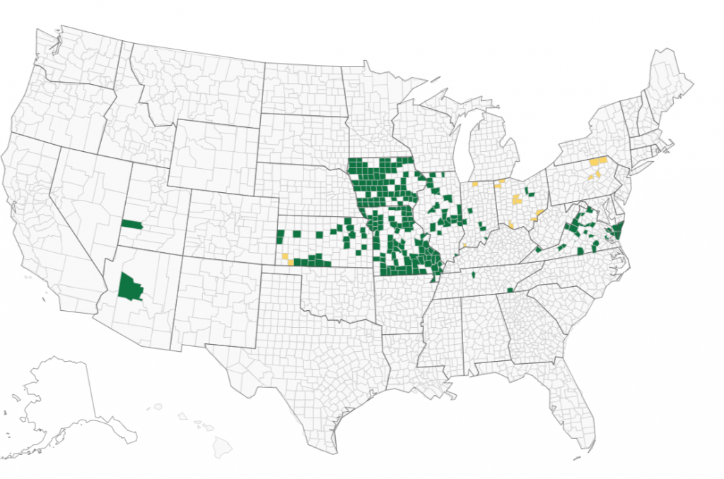
It does not appear that this machine brand could be associated with an alteration in the presidential election results. That does not mean there is “nothing to see” here. But if someone is seriously alleging problems with this machine brand, their allegations may be more productive if they are focused on local elections where the outcome could have possibly changed.
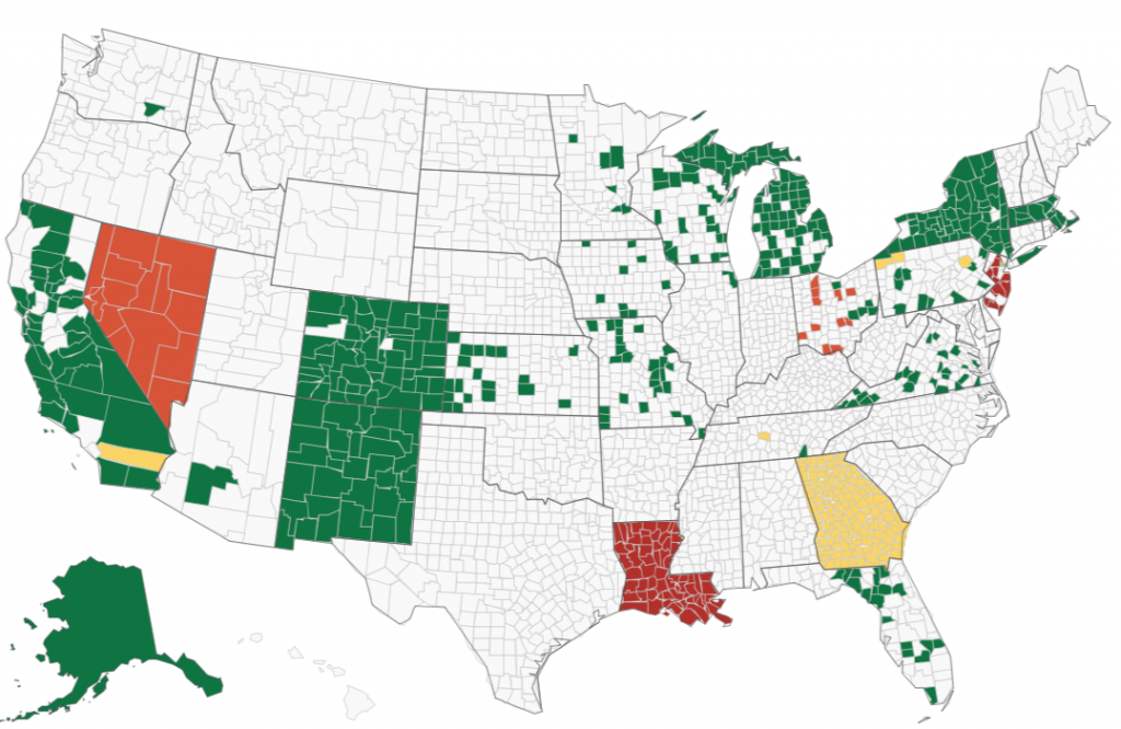
With regards to the Dominion machine brand and the results in Table 3, I will let the readers think about the questions posed above with regards to the Unisyn brand machines and also come up with their own questions specific to the situation to decide for themselves how much, if any, additional scrutiny should be given to the Dominion brand machines. In this study, Dominion brand machines were used in counties with approximately 28.5% of the vote (this number would be higher if we included New York and Alaska) and therefore could have affected the outcome of the presidential election. Here is the Dominion map from VerifiedVoting.org. (Note the different colors indicate different types of machines or processes used by the Dominion brand.)
It is possible to evaluate the strength of allegations of fraud without a prior dataset. When doing so, one must be careful to evaluate many possibilities, avoid confusion from multicollinearity, and consider different error terms. Inserting random variables into the analysis can greatly help assess the randomness of the alleged red flag. It was shown that in this analysis, random variables often appear, incorrectly, to be significant. This issue is greatly controlled, but not eliminated by using the Sandwich technique. Election machine brands can be compared to random variables to assess the strength of a particular theory. Some election machine brands show more non-random correlation than most random variables.
Incidentally, most people who read this are also curious how the various demographic variables faired in this study. Click here to open a different web page that shows the results in HTML format sorted on the median p-value from the Sandwich method.