Overview
Statistical analysis of past presidential races supports the view that in 2020, in counties where Dominion Machines were deployed, the voting outcomes were on average (nationwide) approximately 1.5% higher for Joe Biden and 1.5% lower for Donald Trump after adjusting for other demographic and past voting preferences. Upon running hundreds of models, I would say the national average effect appears to be somewhere between 1.0% and 1.6%.
For Dominion to have switched the election from Trump to Biden, it would have had to have increased Biden outcomes (with a corresponding reduction in Trump outcomes) by 0.3% in Georgia, 0.6% in Arizona, 2.1% in Wisconsin, and 2.5% in Nevada. The apparent average “Dominion Effect” is greater than the margin in Arizona and Georgia, and close to the margin for Wisconsin and Nevada. It is not hard to picture a scenario where the actual effect in Wisconsin and Nevada was greater than the national average and would have changed the current reported outcome in those two states.
Assuming the “Dominion Effect” is real, it is possible that an audit of these machines would overturn the election.
These results are scientifically valid and typically have a p-value of less than 1%, meaning the chances of this math occurring randomly are less than 1 in 100. This article, and its FAQ, shows many ways to model the “Dominion Effect.” In addition to the FAQ, I wrote a highly technical third article where millions of regressions are analyzed which further confirms the article you are currently reading.
The best way to restore faith in the system is to audit the Dominion voting machines in Arizona, Georgia, Nevada, and Wisconsin.
Study Design
In 2008, although Dominion was in many counties in New York and had an insignificant presence in Wisconsin, it had no presence in the rest of the USA.
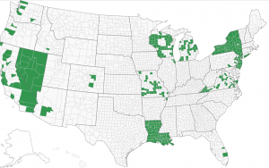
Dominion built up its presence in 2012, increased it in 2016, and increased it further in 2020.
The following images, taken from verifiedvoting.org, show the build up from a geographic perspective.
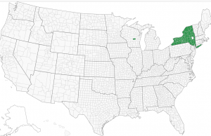

 Dominion Voting Machines 2012
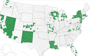
Dominion Voting Machines 2016

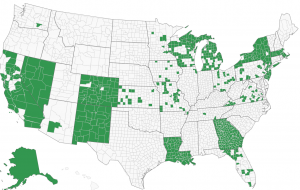
Dominion Voting Machines 2020
We wish to know if Dominion affects elections so we will test election results from 2008, when Dominion was not present, against 2020 when Dominion was fully present and alleged to have committed fraud. We will exclude New York from this analysis because Dominion already had a presence there in 2008. We also will exclude Alaska for lack of county specific data.
Our study is as follows:
- Null hypothesis: Dominion machines are not associated with change in voter outcomes
- Alternative hypothesis: The presence of Dominion machines affects election outcomes.
To do this study, we will link results from 2008 to 2020 by each county, parish, or in some cases city. Since this is usually based on county, we will refer to it as county in this article.
By comparing the county to itself, we are constructing the test similar to how a drug company would test the effects of its proposed therapy. In this case, we have 3,050 counties that do not have Dominion in 2008. In 2020, 657 of the counties have Dominion while 2,388 do not. If we assume that the same societal forces are acting upon all of these counties equally, then in comparing the average change from 2008 to 2020 for Dominion counties versus non Dominion counties, we should have a similar change in voter share. In this regard, it is as if Dominion is the proposed treatment, and non-Dominion is the placebo.
When doing this analysis, we do NOT see a change that is constant across counties. In fact, below are the results comparing 2008 to 2020. A verbal description is “the average US county’s percentage of vote for the Democrat presidential candidate was 8.4 percentage points less Democrat in 2020 (Biden vs. Trump) than in 2008. (Obama vs. McCain). However, despite this 8.4%-point decrease, Dominion counties only decreased 6.4% points, while the non-Dominion counties decreased 9.0% points.”
| Dominion | Number of Counties | Average of Difference |
| No | 2,393 | -9.0% |
| Yes | 657 | -6.4% |
| Total | 3,050 | -8.4% |
Incidentally, you may be surprised that the country trended Republican as a whole. This is not surprising when you realize that we are comparing the outcome of Obama vs. McCain which was not close vs the Biden vs. Trump election which is closer.
Are these results statistically significant?
Yes. We can run a simple linear regression using ordinary least squares, obtaining the following results. Note: a p-value indicates the likelihood of this occurring randomly.
| Variable | Coefficient | P-value |
| Intercept | -8.98% | 0.000% |
| Dominion | 2.55% | 0.000% |
You can verify this yourself by running an ordinary least squares against this dataset.
A pure academician would say, “You are not correcting for heteroscedasticity. Unless you account for this, the results are not valid.” (For purposes of this article, heteroscedasticity is when the error of our model varies by the size of the county.) However, we can correct for this by applying heteroscedasticity-consistent standard errors. By applying this technique, we obtain the following significant results.
| Variable | Coefficient | P-value | P-value Consistent |
| Intercept | -8.98% | 0.000% | 0.000% |
| Dominion | 2.55% | 0.000% | 0.000% |
A pure academician would now say, “You are treating each county the same regardless of its size. You are treating a large place like L.A. County the same as a very thinly populated county.”
We can also correct for this. We can weight each observation by the total number of Republican and Democratic presidential combined votes for 2008 and 2020. Statistically, we will apply the weighted least squares technique.
Furthermore, in addition to using the standard approach, we can use heteroscedastic-consistent error term estimation like we did above. Doing this yields the following results. (You’ll notice that the p-value for Dominion using the weighted-least squares and heteroskedastic consistent approach is 0.26%. This means that this technique gives a 0.26 out of 100 chance that this occurred randomly, which is still considered “statistically significant.”)
| Variable | Coefficient | P-value | P-value Consistent |
| Intercept | -1.72% | 0.00% | 0.00% |
| Dominion | 1.96% | 0.00% | 0.26% |
This analysis can be seen in an Excel workbook here.
Alternatively, this analysis can be performed in R using this
R code and CSV file.
If you would like to verify the data, the assembling of the data can be seen in this sheet.
I obtained data from three sources: 1) Prior election data from: MIT Election Data Science Lab, 2) Current election data from: Politico , and 3) Dominion data from: VerifiedVoting.Org.
Does this prove Dominion is associated with changing election outcomes? No. For example, it could simply mean that the counties adopting Dominion corresponded to counties that were trending less Republican anyway; their lack of trending Republican is statistically significant, independent of Dominion. In fact, I believe this is true, but after controlling for other variables we can eliminate this issue.
Can we control for other factors?
Unlike a drug company’s test of a new treatment, our counties were not randomly selected to be “treated” by Dominion. These counties chose to install Dominion. Was there selection bias? We should control for other factors to see if the presence of Dominion still significantly affects results.
We can obtain demographic data on a county level basis from the U.S. department of agriculture. By attaching this data on a county basis to our already existing dataset, and running multiple linear regression, we obtain the following results. You’ll notice that Dominion’s p-value became more significant as we controlled for other variables. In some cases Dominion is more significant than the control variables.
| Variable | Coefficient | P-value | P-value Consistent |
| Intercept | -8.93% | 0.00% | 0.00% |
| RuralUrbanContinuumCode2013 | -0.52% | 0.00% | 0.00% |
| ManufacturingDependent2000 | -1.02% | 0.00% | 0.00% |
| HiAmenity | 1.92% | 0.00% | 0.00% |
| HiCreativeClass2000 | 6.67% | 0.00% | 0.00% |
| Low_Education_2015_update | 2.41% | 0.00% | 0.00% |
| PopChangeRate1019 | 0.09% | 0.00% | 0.00% |
| Net_International_Migration_Rate _2010_2019 |
0.53% | 0.00% | 0.00% |
| Dominion | 1.65% | 0.00% | 0.00% |
| Variable | Coefficient | P-value | P-value Consistent |
| Intercept | -5.36% | 0.00% | 0.00% |
| RuralUrbanContinuumCode2013 | -0.83% | 0.00% | 0.00% |
| ManufacturingDependent2000 | -2.69% | 0.00% | 0.00% |
| HiAmenity | -0.51% | 0.00% | 27.41% |
| HiCreativeClass2000 | 5.74% | 0.00% | 0.00% |
| Low_Education_2015_update | 3.00% | 0.00% | 0.00% |
| PopChangeRate1019 | 0.19% | 0.23% | 0.00% |
| Net_International_Migration_Rate _2010_2019 |
0.18% | 0.34% | 29.70% |
| Dominion | 1.55% | 0.00% | 0.11% |
To provide a basic interpretation, look at the sign of the coefficient. It is telling you whether the demographic factor increased or decreased Democratic presidential voter percentage. So, from 2008 to 2020:
- The more rural, the less the Democratic share
- The more manufacturing dependent, the less the Democratic share
- The more a county is considered a “high natural amenity,” the more the Democratic share if we consider counties equally weighted but not if we give larger counties more weight. Note this variable has a less significant p-value than some of the others.
- The more a county is considered “high creative class,” the more the Democratic share
- The more a county is considered “low education,” the more the Democratic share
- The more the population increased, the more the Democratic share
- The more international immigration, the more the Democratic share, although one measure had this value with a questionable p-value.
- And most importantly, if Dominion was installed, there was approximately a 1.5%-point increase in Democratic share which also corresponds to a 1.5%-point Republican decrease, so a total swing of 3% points.
If you wish to see this work in Excel, please download this excel file.
If you wish to verify in R, please run this R code.
If you believe specific variables should be tested, maybe we already did. Please see the FAQ. Of note, since publishing this article, we have done many more models. Most of them show the Dominion coefficient to be above 1.5% and p-values that are below 1%. One model shows the Dominion coefficient at 1.42%, and I put that particular model’s entire results in the FAQ. If you run hundreds of models, there is a range of estimated Dominion Effects that are typically between 1.0% and 1.6%.
If the “Dominion Effect” is real, would it have affected the election?
This article showed a range of estimates for the “Dominion Effect,” the more persuasive being from the multiple linear regression analysis:
- Multiple Linear Regress: Ordinary Least Squares: 1.65%
- Multiple Linear Regress: Weighted Least Squares: 1.55%
I find the weighted least square model the most persuasive and refer to it often in the FAQ.
If there is a Dominion Effect, it adds that percentage to Democrat presidential vote and subtracts from Republican. If the Dominion Effect is real, it may have affected this close election. For Dominion to have switched the election from Trump to Biden, it would have had to increase Democratic presidential outcomes by 0.3% and reduced Republican outcomes by 0.3% in Georgia. The factors for the other states are 0.6% in Arizona, 2.1% in Wisconsin, and 2.5% in Nevada. Click here to see the math.
If you believe the Dominion Effect is real, it is not hard to believe that this effect would be greater in swing states and could have swung these four states into Biden’s column, putting the electoral college in his favor.
What does this mean?
It means that Arizona, Georgia, Nevada, and Wisconsin should allow the Republicans to audit the machines.
Let me pose these questions to the following individuals/entities:
Future President Joe Biden: Do you want a significant portion of the population to believe your presidency was only won through Dominion voting systems?
Dominion Corporation: Do you want a significant portion of the population to distrust you and demand that your machines are not used?
Arizona, Georgia, Nevada, and Wisconsin election officials: Do you want a significant portion of your constituents to believe you are part of a conspiracy?
Transparency is the key to solving this. Although there will always be a fringe group that will never believe the results of such an audit, why not prove them wrong? They are already alleging fraud and doing it in such a way that a significant portion of society already knows about it. Here is a good example from comedian JP Sears: this information is making its way through society.
And I just showed you statistics that will be used to allege conspiracy.
If you think ignoring this will make it go away, I believe you are mistaken.
Do we want another four years where one side of the political divide continually argues that the election was not valid? Will that help our society?
How should we talk about this?
Feel free to use this data and analysis as you see fit. If you find that I did something wrong, please politely tell me, and I’ll gladly update my post.
I do not wish to be a part of any sort of misinformation, which is why I am being fully transparent in showing my data sources, methods, and identity. I wish to have cordial dialogue with those who disagree. Please note, I have a FAQ page to respond to questions about this analysis. It is always possible for statistical models to show something different than what one thinks they are showing, and I can readily admit that. If my analysis and/or data have issues, I want to know about it and I want to correct this post.
We are all fellow citizens, and I recommend we become united in our effort to support transparency as it pertains to democracy.
I recommend we audit the machines.
Author Biography
Ben Turner has spent most of his career as an actuary in the insurance industry. From 2006 to 2016 he was with Texas Mutual, serving the last several years as SVP and Chief Actuary. In 2016 he accepted a position at Windhaven, working as the president to help a struggling insurance company. Although unable to prevent the company from going into run-off, his experience required a deep dive into the fraud industry that caused Windhaven’s demise. Since then, Ben has dedicated his career to understanding the mathematics of fraud. In 2020, Ben Turner created FraudSpotters, a company providing software for insurance companies to help them identify fraud rings. In addition to his experience, he is a member of the American Academy of Actuaries, an Associate in the Casualty Actuarial Society, an inactive member of the California bar, a graduate of the BYU MBA program, and a graduate of BYU law school.
The best way to reach him is via Linked-In.
Why I did this research.
On 11/19/2020, at the RNC, Sydney Powell alleged that our vote has been improperly altered by Dominion machines.
RNC press conference, 11/19/2020
I don’t know how to process these allegations. They sound so extreme and far-fetched that they are easy to blow off as ridiculous.
On the other hand, HBO has an excellent documentary called Kill Chain: The Cyber War on America’s Elections. I’ve seen it and can recommend. Here is a link to a review at Mother Jones.
I decided I should substantiate or disprove what I was hearing. My goal was to write an article either showing “nothing to see here” or explaining why more auditing/investigation should occur.
I recommend we audit the machines.
By the way, if you have read this far, there is more interesting work shown at the FAQ. I recommend you check it out.